Worthy Brewing Co. Brand Redesign
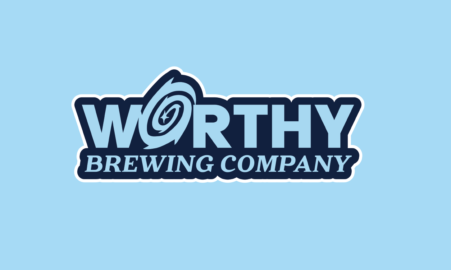
Worthy has always set out to be unique not only by having an operational observatory in its brewery but also by having the environment be the first priority. This new logo sets out to explain just that. Hops are expected in brewery logos, so this new logo helps showcase exactly what sets Worthy apart. The bold san serif typeface exemplifies the strength and support Worthy has in the Bend community and the serif sub-title shows its commitment to open communication and collaboration with the local environment and people.
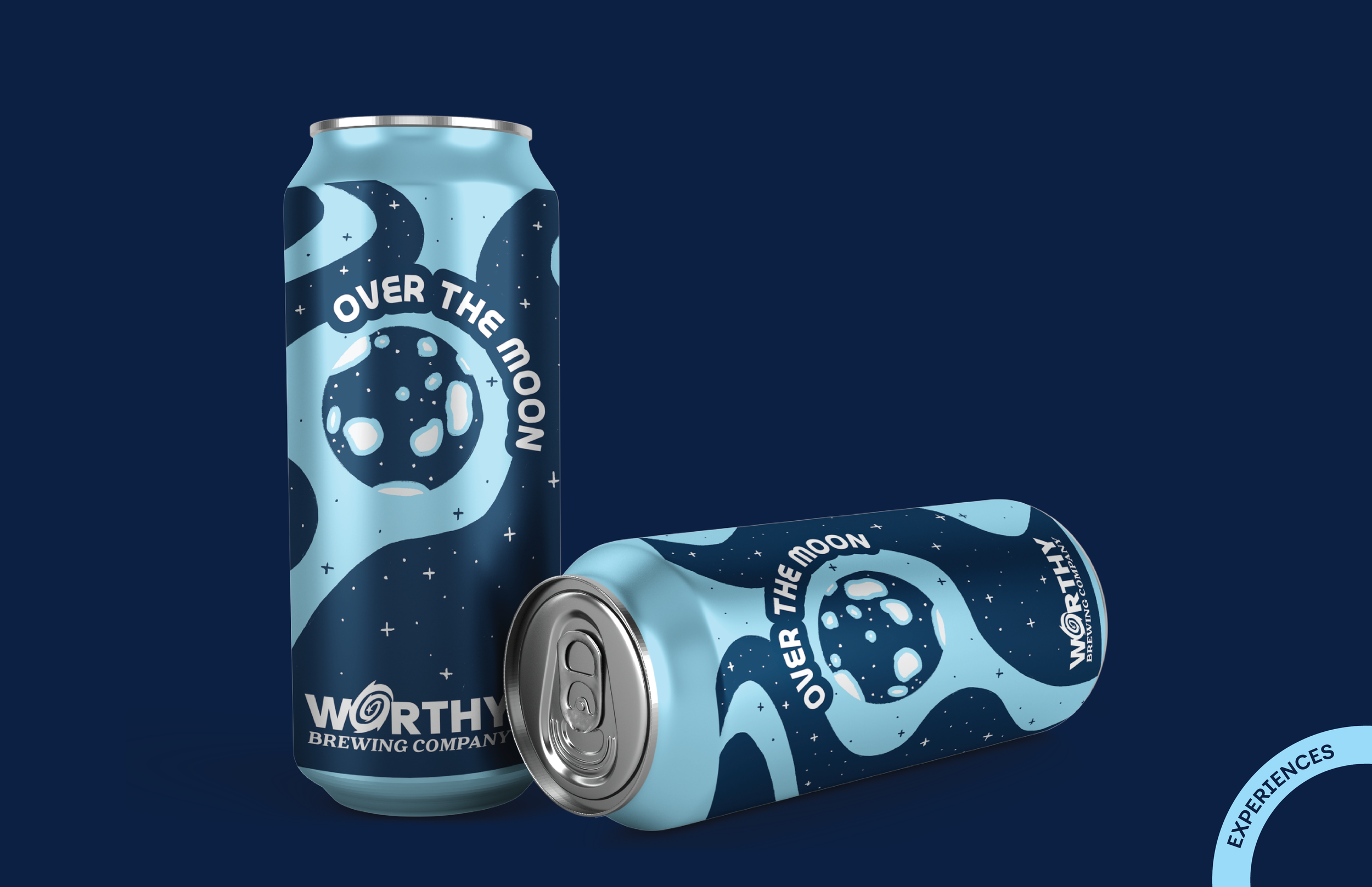
Hypothetical brand redesign involved logo, color, type, mission statement, merchandise, and product revision in the form of a 32 page style guide.